
Medilytics Branding
Medilytics Branding
Medilytics Branding
Explore
Inclusive Brand Design
Create
Appealing Style Guide &
Logo
Explore
Inclusive Brand Design
Create
Appealing Style Guide &
Logo
Spring 2024
Spring 2024
Spring 2024
Explore
Inclusive Brand Design
Create
Appealing Style Guide &
Logo
Medilytics Branding
Case Study
Medilytics is a startup initiative created by two
entrepreneurs affiliated
with Purdue University. Their goal is to create
a demand-forecasting software that allows
for pharmaceutical companies to factor in insurance
policy changes.
This allows companies to be better
prepared for supply chain demands and
make sound financial decisions.
But how will they stand out amongst their
competition?
Medilytics Branding
Case Study
Medilytics is a startup initiative created by two entrepreneurs affiliated with Purdue University. Their goal is to create a demand-forecasting software that allows for pharmaceutical companies to factor in insurance policy changes.
This allows companies to be better
prepared for supply chain demands and make sound financial decisions.
But how will they stand out amongst their competition?
Deliverables
High Fidelity Logo
Company Style Guide
Handoff Document
Tools
Sketchbook
Figma
Deliverables
High Fidelity Logo
Company Style Guide
Handoff Document
Tools
Sketchbook
Figma
Overview
In order to best aid Medilytics, I was tasked with one of two main goals:
1. Creating inclusive brand elements and design guidelines for the company
2. Creating a predictive market dashboard mid-fidelity mockup for pre-seed investors
In terms of branding, one of the challenges I faced was the caveat(s) of design freedom.
On one hand, I was able to seek inspiration from many reference images and other logos
currently out on the market, but I needed to rein myself back to the evolving needs of
Medilytics.
After conducting a comparative analysis with my UX team, the Purdue UXperts, I sought
feedback from Medilytics on their vision for the color scheme, font choice and product
name to create their unique logo.
Problem/Context
In order to best aid Medilytics, I was tasked with one of two main goals:
1. Creating inclusive brand elements and design guidelines for the company
2. Creating a predictive market dashboard mid-fidelity mockup for pre-seed investors
In terms of branding, one of the challenges I faced was the caveat(s) of design freedom. On one hand, I was able to seek inspiration from many reference images and other logos currently out on the market, but I needed to rein myself back to the evolving needs of Medilytics.
After conducting a comparative analysis with my UX team, the Purdue UXperts, I sought feedback from Medilytics on their vision for the color scheme, font choice and product name to create their unique logo.
Overview
In order to best aid Medilytics, I was tasked with one of two main goals:
1. Creating inclusive brand elements and design guidelines for the company
2. Creating a predictive market dashboard mid-fidelity mockup for pre-seed investors
In terms of branding, one of the challenges I faced was the caveat(s) of design freedom. On one hand, I was able to seek inspiration from many reference images and other logos currently out on the market, but I needed to rein myself back to the evolving needs of Medilytics.
After conducting a comparative analysis with my UX team, the Purdue UXperts, I sought feedback from Medilytics on their vision for the color scheme, font choice and product name to create their unique logo.
Summer 2023
Approach
Main Project Goal
Design a unique logo & style guide for Medilytics startup to impress pre-seed investors

Contribution
Figma Mockups V1 - V3
Tested Logo & Style Guide for Predictive Dashboard


Sketching Brand Elements
Context
At the start of the project, I decided to start sketching out some scratch ideas for the two Purdue student sponsors.
At that time, they were going by Predimed and were contemplating about switching the name to ClearifyRx. One source of inspiration I found in my sketches was the term, "medical desert".
This term inspired a transfiguration of cacti and gelatin pill capsules as seen in my illustrations to the left.
I was also inspired by minimalistic logos such as GoodRx(similar market) and LOUIS VUITTON(adoptable font family).
Outcome
I created a cactus pill logo and decided to stick with a less abstract typography for the next logo iterations.
In order to produce a logo that is both unique and recognizable without hesitation, I would need to add these details in with the help of feedback from the sponsors as well as my fellow team members.
It was a good start to the logo ideation process, but as with all ideas, we take the best of what is created and keep improving it until the final product.
Main Project Goal
Design a unique logo & style guide for Medilytics startup to impress pre-seed investors
Contribution
Iterative Figma Mockups
Tested Logo & Style Guide on Predictive Dashboard
Sketching Brand Elements
Context
At the start of the project, I decided to start sketching out some scratch ideas for the two Purdue student sponsors.
At that time, they were going by Predimed and were contemplating about switching the name to ClearifyRx. One source of inspiration I found in my sketches was the term, "medical desert".
This term inspired a transfiguration of cacti and gelatin pill capsules as seen in my illustrations to the left.
I was also inspired by minimalistic logos such as GoodRx(similar market) and LOUIS VUITTON(adoptable font family).
Outcome
I created a cactus pill logo and decided to stick with a less abstract typography for the next logo iterations.
In order to produce a logo that is both unique and recognizable without hesitation, I would need to add these details in with the help of feedback from the sponsors as well as my fellow team members.
It was a good start to the logo ideation process, but as with all ideas, we take the best of what is created and keep improving it until the final product.
Creating Mid and High Fidelity Mockups
After sketching, I decided the best way to iterate was to place my sketches inside the Figma application, so that I could use more
precise tools in the form of shapes, lines, and ref image pasting
It was in this stage that the sponsors went through another name change, from ClearifyRx to Medilytics, as this allowed them to
align their company's brand with providing analytical data for pharmaceutical companies in the current market
Creating Mid and High Fidelity Mockups
After sketching, I decided the best way to iterate was to place my sketches inside the Figma application, so that I could use more precise tools in the form of shapes, lines, and ref image pasting
It was in this stage that the sponsors went through another name change, from
ClearifyRx to Medilytics, as this allowed them to
align their company's brand with providing analytical data for pharmaceutical companies in the current market

Mid-Fidelity Mockup V1
Mid-Fidelity
Mockup V1
Mid-Fidelity
Mockup V1

Mid-Fidelity Mockup V2
Mid-Fidelity
Mockup V2
Mid-Fidelity
Mockup V2

Mid-Fidelity Mockup V3
Mid-Fidelity
Mockup V3
Mid-Fidelity
Mockup V3
High-Fidelity Mockup Inspiration 1
High-Fidelity Mockup Inspiration 1
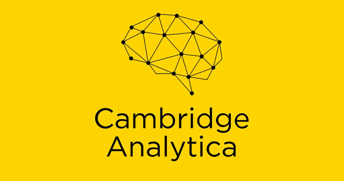
One of the two main inspirations I gathered in a small comparative analysis was the Cambridge Analytica logo, for its node design and simple color palette.
High-Fidelity Mockup Inspiration 2
High-Fidelity Mockup Inspiration 2
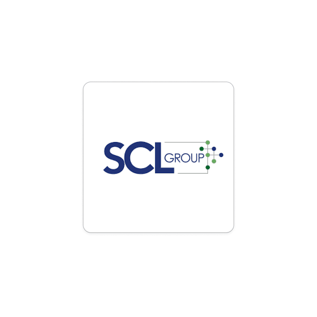
The second main inspiration from the comparative analysis was the SCL Group logo for its typography and node placement(s).
Applying Brand Elements to Predictive Dashboard
Making a logo is already a project inside of itself, but as with all logos and branding, it needs to be
utilized for Medilytics to grow its brand recognition.
Thus, it was placed within a dashboard created by my fellow Purdue UXPerts:


Lessons from the project…
Constant iteration doesn't always mean better
At the beginning of the project, I was excited to take ownership of the logo and branding identity for Medilytics. However, I started pushing myself too hard towards a unique and distinguished logo through iterating instead of grounding the more minute details and elements. For example, I didn't think about a color scheme too early since I wanted to start making abstract designs and something of a "wow factor".
Much to my chagrin, my breakthrough didn't come about until I started to slow down my imagination and just edit the design into a blue and orange color palette, keep a more Times New Roman pattern for readability, and finally, take inspiration from what is already minimalist and clean, since this aligns better with tech companies than artistic ones in the market.
Logo
I came up with several iterations of the Medilytics logo, which went through several
name changes during the course of the project.
This final logo was created in order to better represent their product and brand, as
their UVP or unique value proposition is providing forecasting analysis on Rx drugs
within the broader United States.
In addition to the logo, I created a style guide that would include the logo's colors as
well as purple as an accent color to accommodate for users that might be colorblind or have
trouble with their vision. Since purple has cool and warm hues baked into it, it allows for a
broader range of visual clarity.
This allows the designs to be more inclusive in the long-term
and does not create usability issues for users at the start.
Solution
I came up with several iterations of the Medilytics logo, which went through several name changes during the course of the project.
This final logo was created in order to better represent their product and brand, as their UVP or unique value proposition is providing forecasting analysis on Rx drugs within the broader United States.
In addition to the logo, I created a style guide that would include the logo's colors as well as purple as an accent color to accommodate for users that might be colorblind or have
trouble with their vision. Since purple has cool and warm hues baked into it, it allows for a broader range of visual clarity.
This allows the designs to be more inclusive in the long-term
and does not create usability issues for users at the start.


Let's Work Together!
Let’s collaborate and bring fresh concepts to life. Drop a line below!

Linktree
Linktree
© Nikolai Hoogewerf - The Concept Kanvas