October - November 2022
Happy Pots
Understand Culture Food Accessibility | Create Online Platform for International Foodies
Happy Pots
Case Study
Purdue University hosts a population of
about 52k students in total, with 18% of the
population comprising of international students
With more than 9,500 international students
currently on Purdue's campus, one would think
food options from overseas would be accessible,
especially in the age of technology, right?
Well, it is still inaccessible past buying
snacks off Amazon and similar vendors, which
only treats the symptoms of international
food inaccessibility, not its source: Lack of
authentic, sustainable international
restaurants
So, how can we fix this food inaccessibility
while keeping the budgets and time
constraints of international students in mind?
Deliverables
HTML5/CSS Code
Website Documentation
Mid-Fidelity Platform
Tools
Miro
Figma
Google Docs
Mid-Fidelity Platform


Summer 2023
Design Approach
Design Goal
Create a web-based platform for Purdue International foodies feeling homesick and craving authentic cuisines
Contribution
Created a mid-fidelity mockup for home page
Conducted focus group workshop with 3 international students
Secondary Research
I was tasked with creating the homepage for the Happy Pots website. In order to form the layout and features, I conducted secondary research into color theory and visual hierarchy.
Color theory was necessary to inspire warmth and food cravings within a communal space.
Visual hierarchy was placed into my designs so that it would be both striking and concise. Without it, I would not engage myself nor any viewers who might be searching for home-cooked meals from their home countries in Asia.
After focusing on these visual principles, I started to gather two thoughts:
Making the color palette warmer would help with communicating the food theme and promote a communal feel
I would need to make the interactions simple and concise for users to find their information quickly and with only the necessary information for attending our potluck events
Since the home page is one of the most crucial pages for a web experience, I chose to make it condensed and flowy. That way, the events page and cultural food lists would be prioritized.
With this being one of my first dabbles in HTML5/CSS coding, I made to sure to understand the placement of tags and classes before heading into Figma to create these mockups.
Process


Focus Group Workshop

Ice Breakers
Goal
I wanted to get the international students in the room comfortable with our design and research activities with conversation starters.
Questions
How are you enjoying Purdue's campus culture? What's your first thoughts when you hear the words, "campus culture"?
Imagine a restaurant or tent at a cultural event offers an authentic cultural dish from your home country. How would you feel? What are your thoughts and reactions?
Insights
Participants had apathetic thoughts about local food and a strong yearning for their culture's food
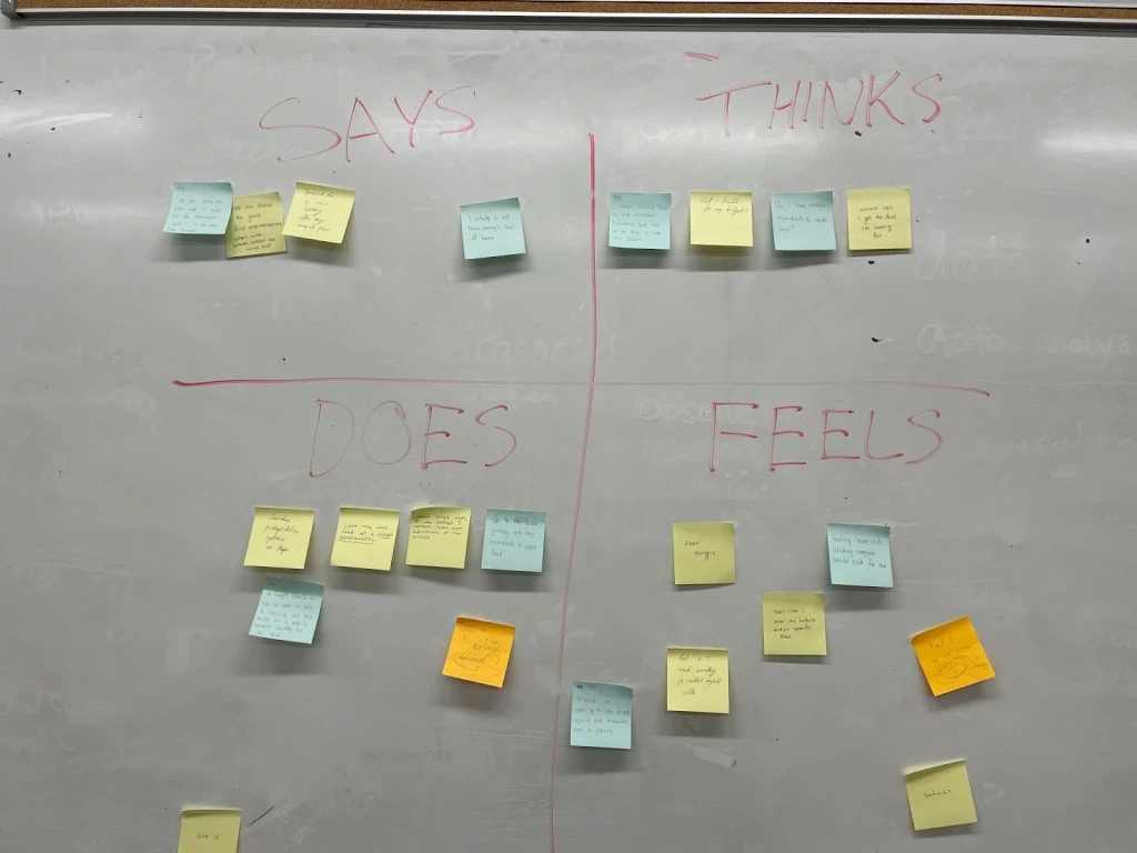
Empathy Mapping
In order to engage our participants in our workshop, we asked them to write down their thoughts and reactions on sticky notes, and to post them within the four quadrants
1. Says 2. Thinks 3. Does 4. Feels
Goal
Highlight the importance of empathy in design, while thinking about each participants' relationship with food.
Insights
Participants were frustrated by food inaccessibility and lack of campus resources available
Website Wireframing
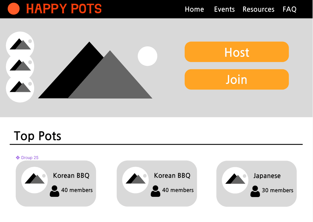
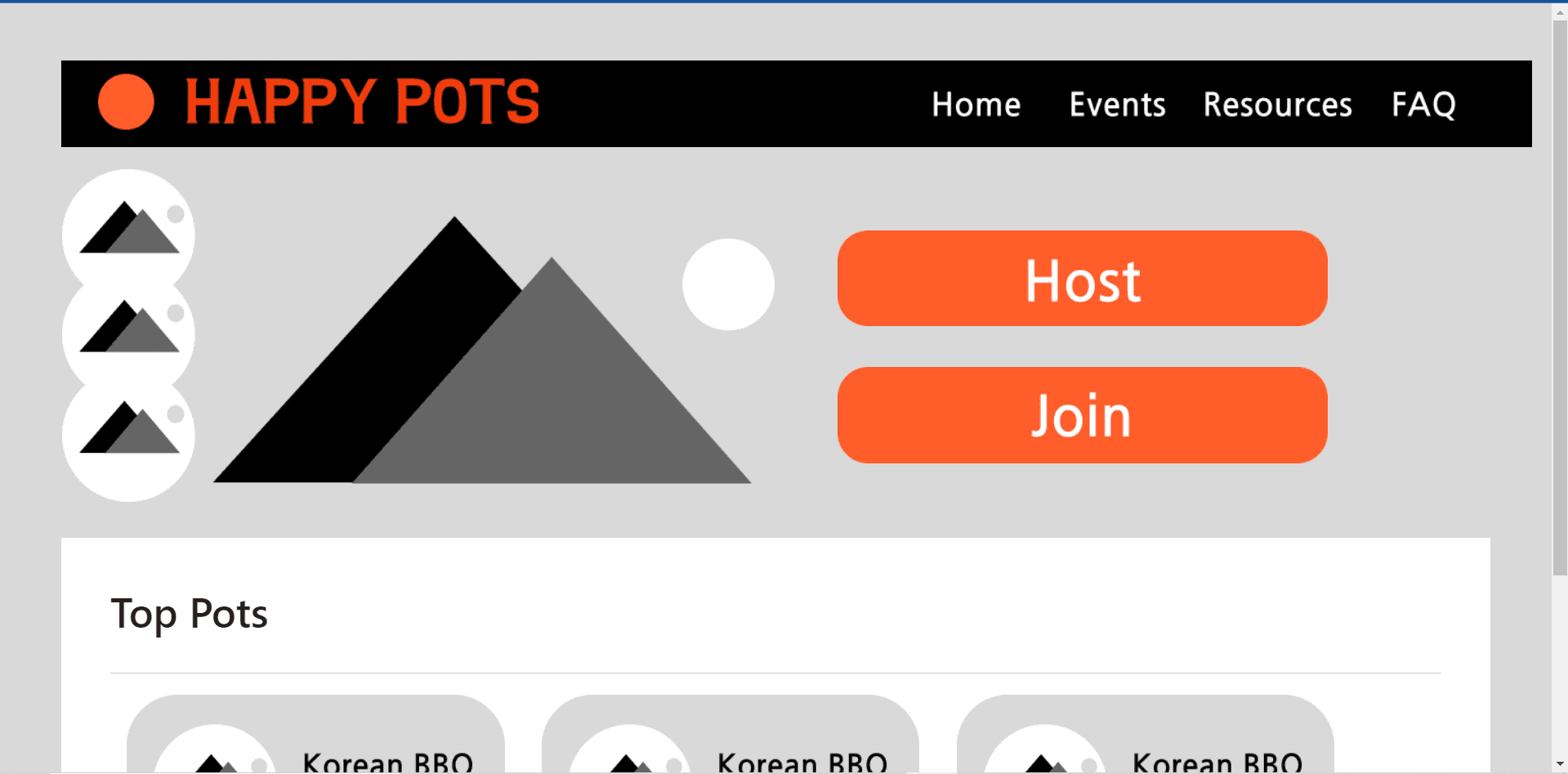
Home Page V1
We knew of the impact of color theory within corporate fast food brands in the the global market. So, we decided to entice viewers with a reddish-orange hue. It is known to be a common color for foods popular in Asia.